Blush Out West
Rooted in the West. Ready for its next chapter.
A journey from the western buying trip to the boutique. A fashion concept that replaces an overwhelming product grid with chapters, clear collections, and the people behind the brand.
- Scope
- Design audit, UX research, Product architecture, Storefront concept
- Current store
- blushoutwest.com
- Proposal
- Full project proposal
- Status
- Independent concept, not a client engagement
Step inside.
Move between the live concept, the design audit and the UX research. Any of them can open in a new tab.
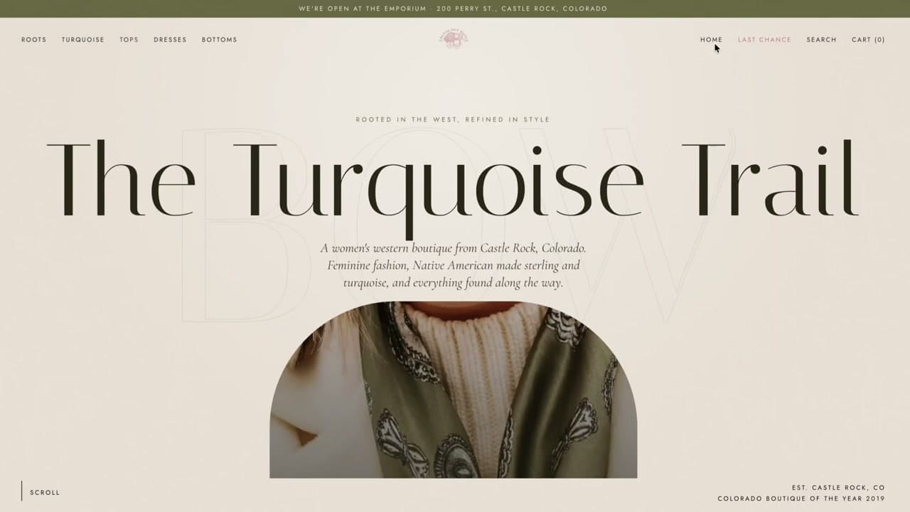
The interactive storefront concept, shown at desktop width.
The thinking behind the redesign
The opportunity
The catalog was hidden in the menu while the homepage showed fifty products at once.
The direction
Turn the homepage into an editorial journey with visible collections and a stronger sense of place.
Findings first.
Then the design.
Three findings from the design audit and three from the UX research, quoted from the documents. The personas are composites from the research, not real customers.
The design audit
- CRITICAL
The whole catalogue is hidden behind a hamburger, on desktop as well as mobile
The store has ten collections, from Tops to Home Decor & Gifts, but none of them are visible until a visitor clicks the menu icon at the far left.
- CRITICAL
A newsletter popup opens over the hero before the visitor sees anything
The Mailchimp popup appears within two seconds of the page loading and sits over the hero photograph.
- CRITICAL
The homepage is one 50-product grid, 12,688 px tall on desktop and 24,655 px on a phone
There are no category tiles, no new arrivals block and no best sellers, so the page cannot be scanned.
The UX research
- PERSONA
Kayla, the event dresser
I need the outfit for Saturday, and I want people to ask where I got it.
- PAIN POINT
Cannot see what the store sells without opening a menu
Navigation first: a visible category bar and category tiles fix the largest problem for every persona at once.
- JOURNEY
From Instagram to a top in the cart, on a phone
Today this route needs eight to ten screens of scrolling and two dead ends.
Other stores.
Same closer look.
Every concept begins with a real storefront and ends with a working idea. Step inside another one.
- 01
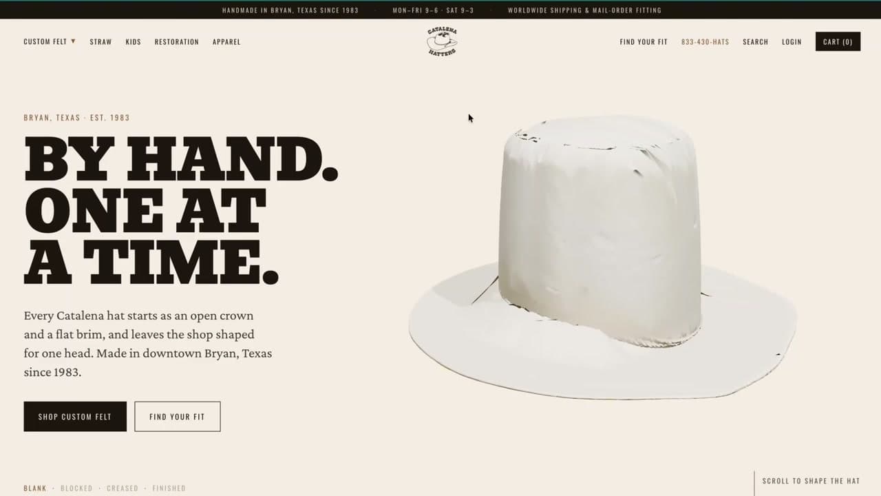
Catalena Hatters
HERITAGE / CUSTOM HEADWEAR - 02
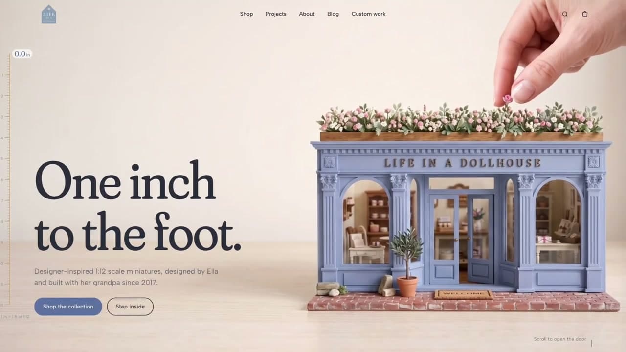
Life In A Dollhouse
LIFESTYLE / MINIATURE WORLDS - 03
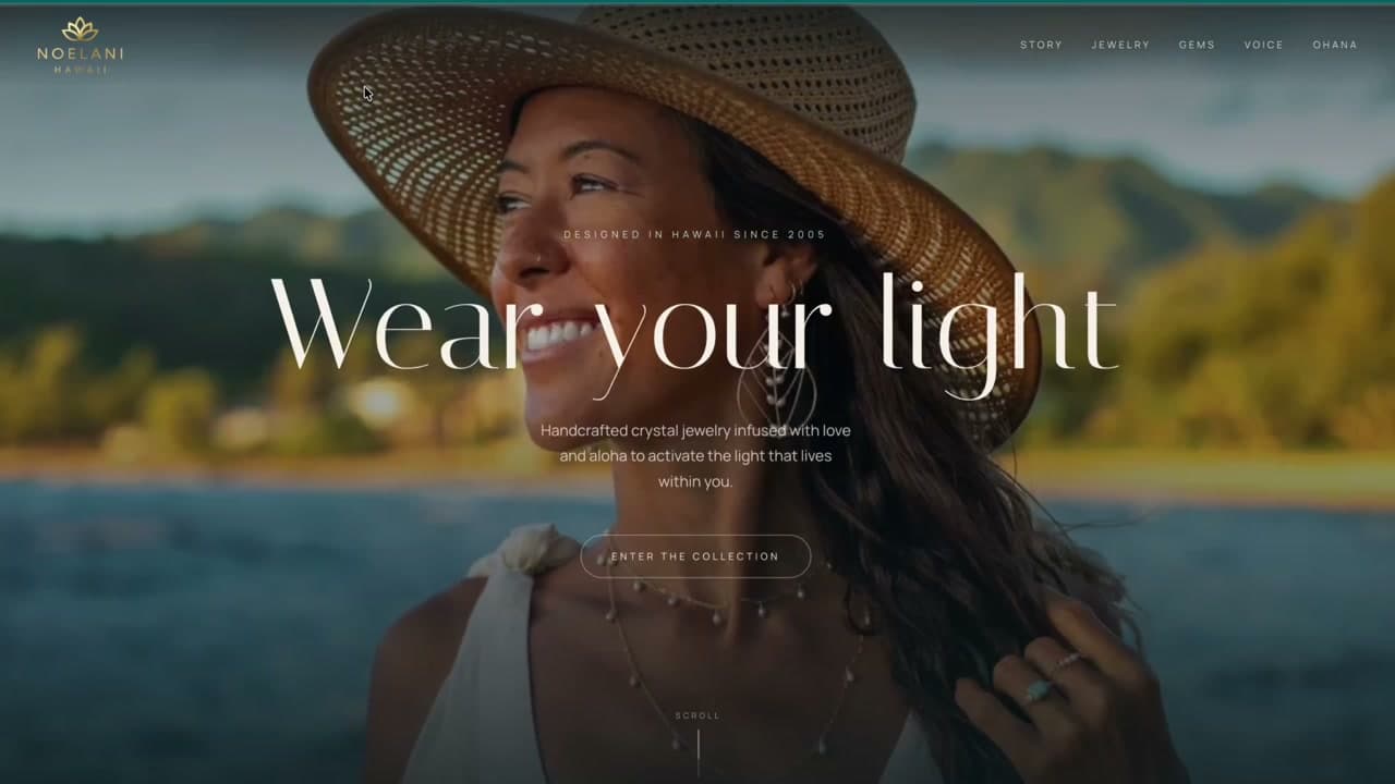
Noelani Hawaii
JEWELRY / ISLAND SOUL - 05
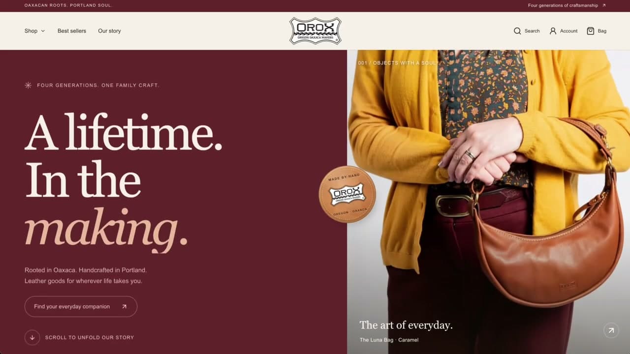
Orox Leather Co.
LEATHER GOODS / GENERATIONAL CRAFT - 06
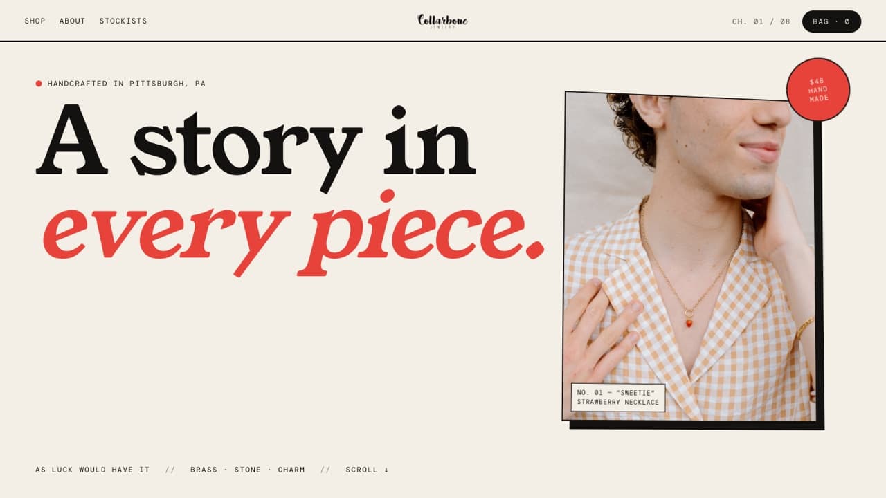
Collarbone Jewelry
JEWELRY / PLAYFUL SELF-EXPRESSION - 07
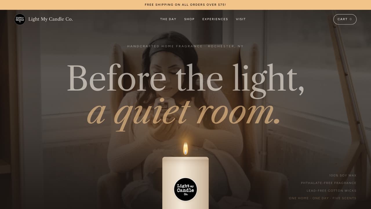
Light My Candle Co.
HOME FRAGRANCE / EVERYDAY RITUALS - 08
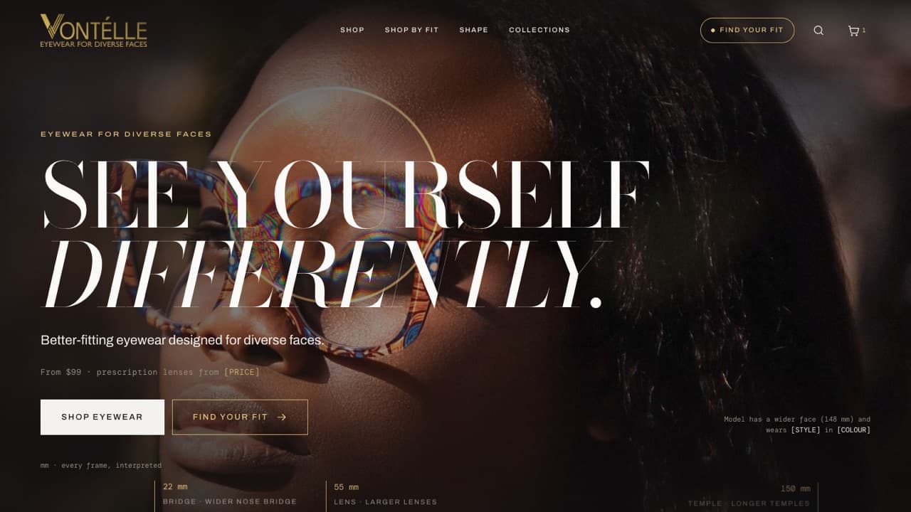
Vontélle
EYEWEAR / INCLUSIVE FIT - 09
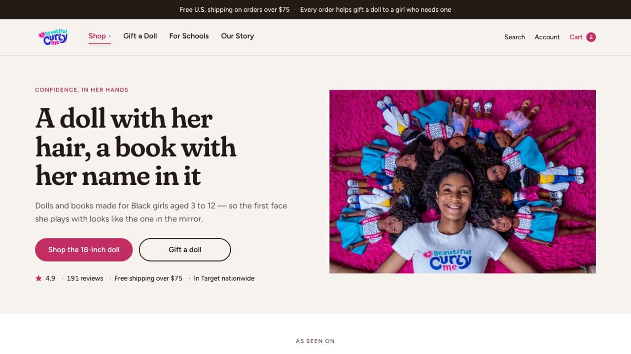
Beautiful Curly Me
DOLLS & BOOKS / CURL CONFIDENCE
The same care,
for your store.
Every concept here grew out of these packages. Pick the one your store needs first.
 Strategy
Design Audit
A fresh pair of eyes. A clear next move.Delivered as a PDF report with annotated screenshots$99 USD Strategy
UX Research
Understand the people behind the purchase.Delivered as a PDF research report$99 USD Design
Theme Redesign
Your brand’s story, in storefront form.Delivered as Figma design files, or a ready-to-import Shopify theme .zip with developmentFrom $599 USD Strategy
Product Architecture
Make finding the right thing feel effortless.Delivered as a PDF plan with the navigation map$299 USD Content
UGC Video Generation
Creator-style videos, without the shoot.Delivered as MP4 video files in 9:16$199 USD Support
Monthly Maintenance
A little care. A shop that keeps getting better.Delivered live in your Shopify store, with a monthly summary$499 USD / month
Your store could be next.
Every concept here began with a real storefront and a closer look. Yours can start with a conversation.