Noelani Hawaii
More than jewelry. A feeling you can wear.
A Hawaiian jewelry story told through landscape, intention, and craft. The concept connects the brand’s collections, gemstone guide, and music in one flowing experience.
- Scope
- Design audit, UX research, Art direction, Storefront concept
- Current store
- noelanihawaii.com
- Proposal
- Full project proposal
- Status
- Independent concept, not a client engagement
Step inside.
Move between the live concept, the design audit and the UX research. Any of them can open in a new tab.

The interactive storefront concept, shown at desktop width.
The thinking behind the redesign
The opportunity
A distinctive collection and a rich story were difficult to discover.
The direction
Let the story introduce the jewelry, connect the collections, and bring gemstone guidance into the experience.
Findings first.
Then the design.
Three findings from the design audit and three from the UX research, quoted from the documents. The personas are composites from the research, not real customers.
The design audit
- CRITICAL
A newsletter popup covers the page on arrival, on every page, and it stays put when you scroll
On the product page it covers the hero image entirely; on the collection page it covers the first row of products; on search results it covers the results.
- CRITICAL
Four of the five top-level menu items lead away from the shop
The entire 102-product catalogue sits inside a single JEWELRY dropdown, while ‘Vocal Course’, ‘Sound Healing’, ‘Concerts’, ‘Listen Now’ and ‘Press Kit’ each get their own top-level real estate.
- CRITICAL
Add to cart sits below the fold on a phone and there is no sticky bar to bring it back
On /products/perfect-hoops-larimar at 390 x 844, the Add to Cart button’s top edge is at 904 px — 60 px below the bottom of the screen on arrival.
The UX research
- PERSONA
Marisol, on the last day of the trip
She is not researching — she wants one piece that will remind her of this week, and she is buying it today or not at all.
- PAIN POINT
The buy button is never on screen when the decision is made
Every phone visitor who reads the description has to scroll back up to buy.
- JOURNEY
Deciding whether to trust the shop from 6,000 km away
Today’s route ends with her closing the tab and buying from the Japanese brand, not because the piece is worse but because the page gave her nothing to check.
Other stores.
Same closer look.
Every concept begins with a real storefront and ends with a working idea. Step inside another one.
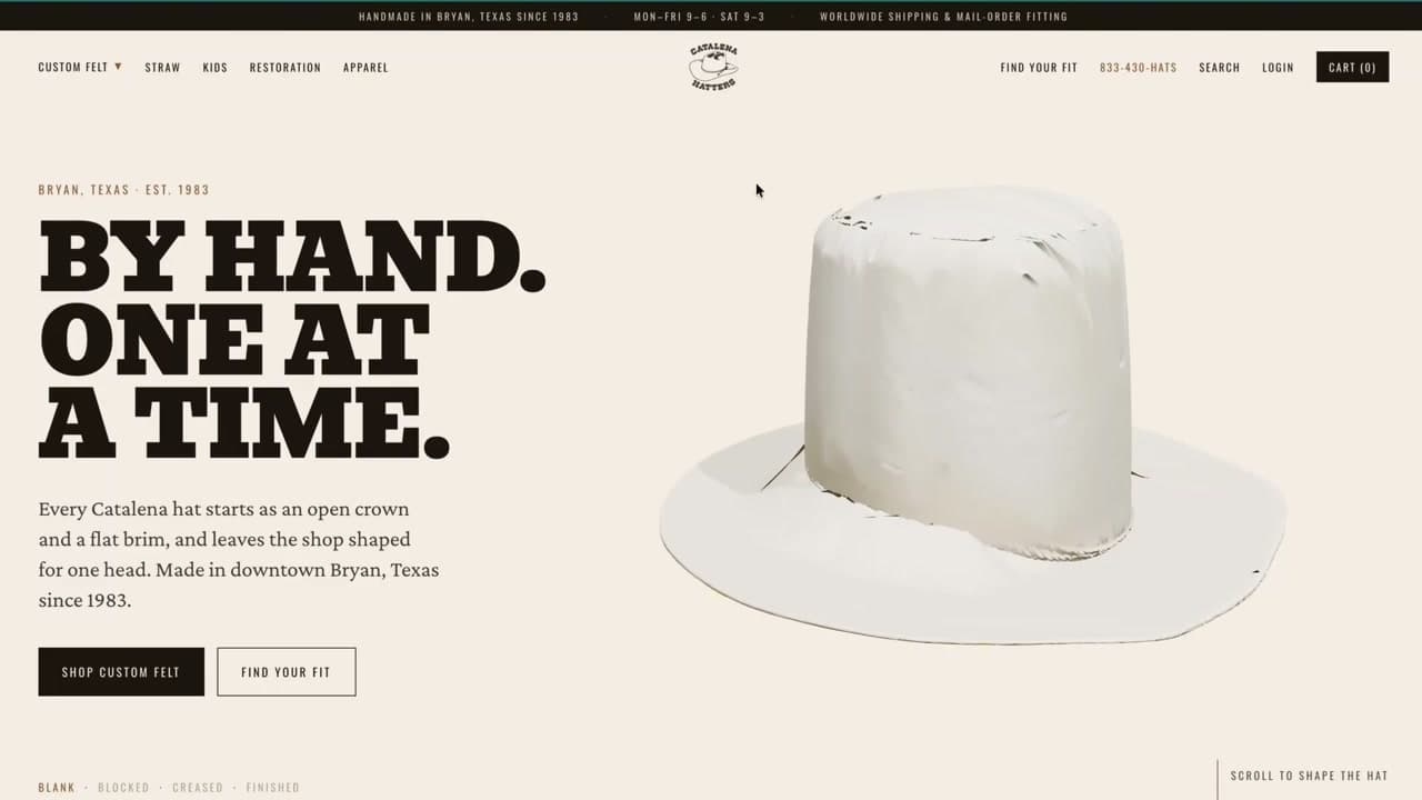
- 01
Catalena Hatters
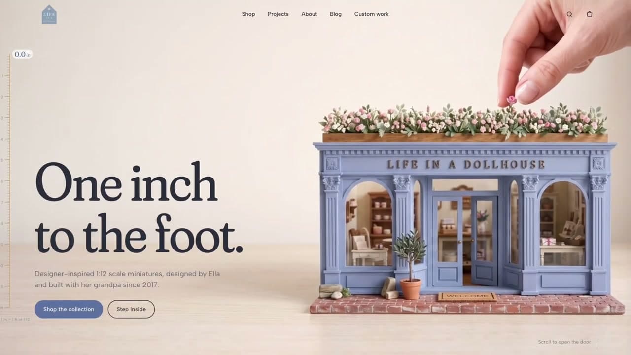
HERITAGE / CUSTOM HEADWEAR - 02
Life In A Dollhouse
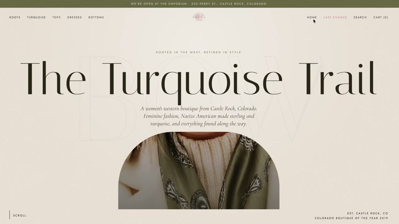
LIFESTYLE / MINIATURE WORLDS - 04
Blush Out West
FASHION / WESTERN SPIRIT - 05
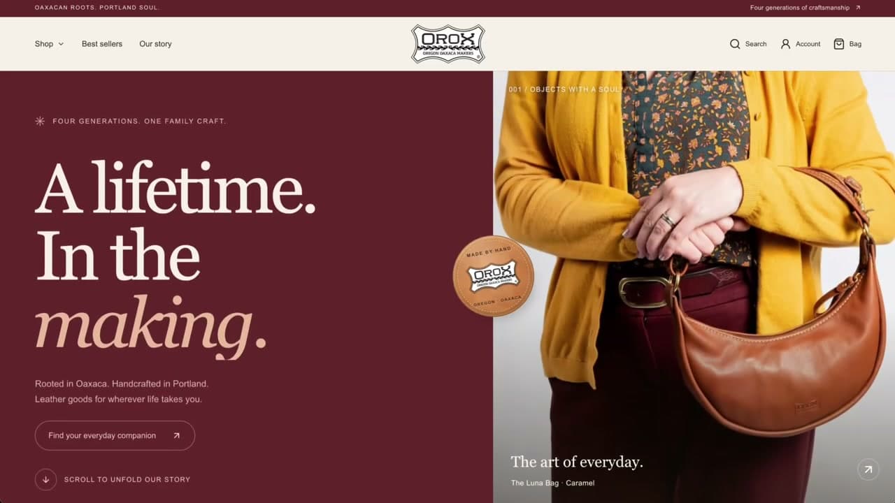
Orox Leather Co.
LEATHER GOODS / GENERATIONAL CRAFT - 06
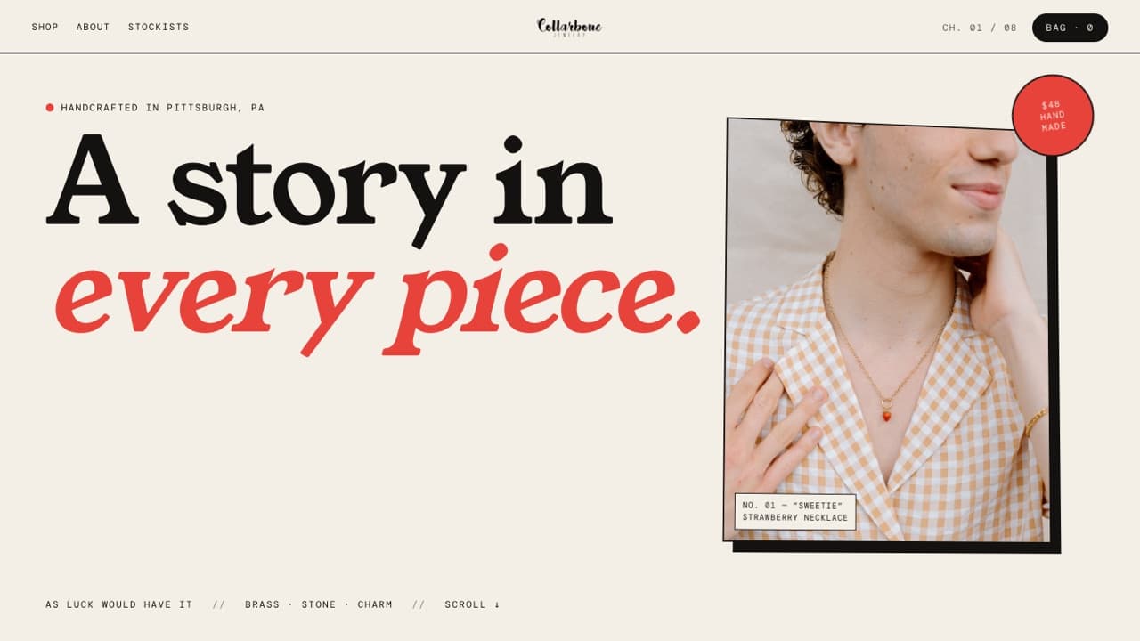
Collarbone Jewelry
JEWELRY / PLAYFUL SELF-EXPRESSION - 07
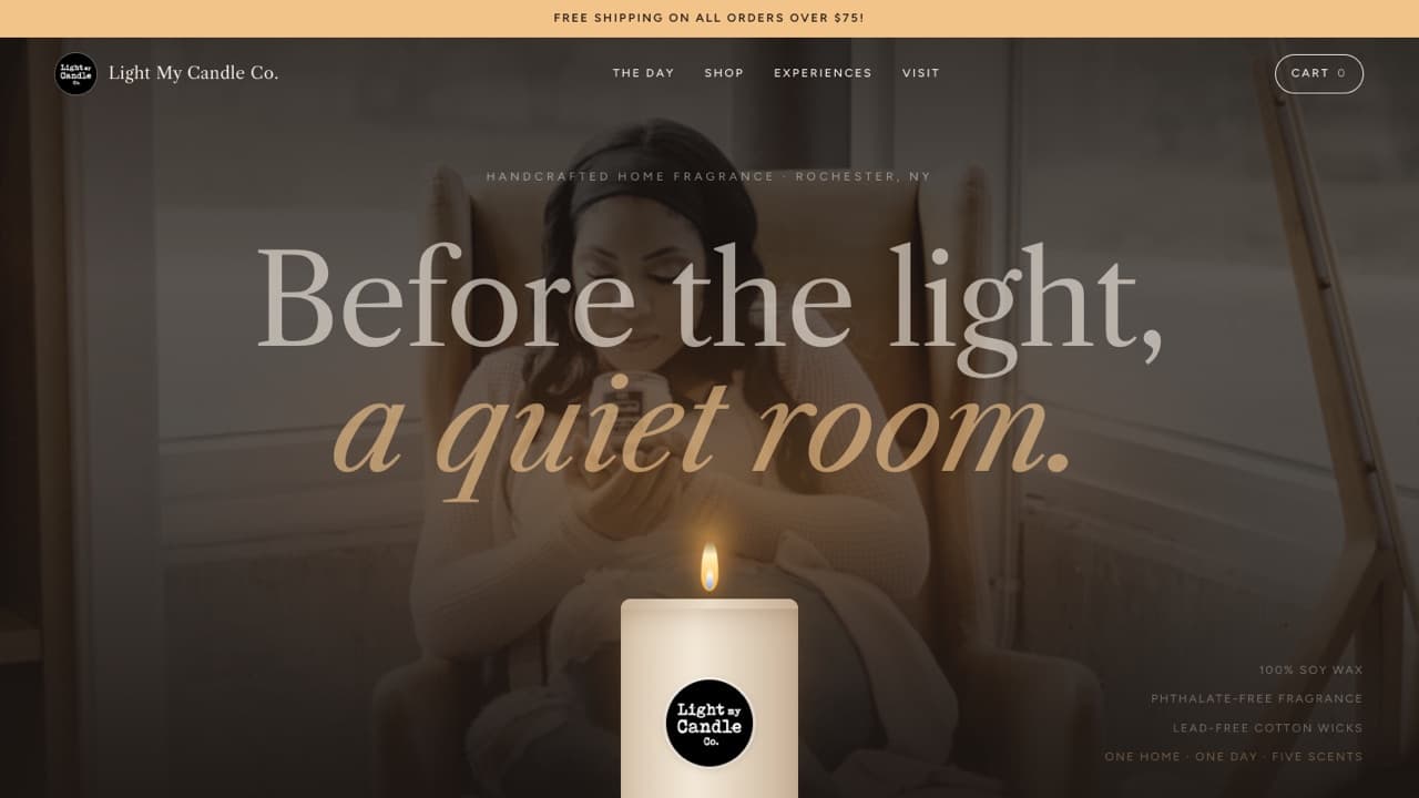
Light My Candle Co.
HOME FRAGRANCE / EVERYDAY RITUALS - 08
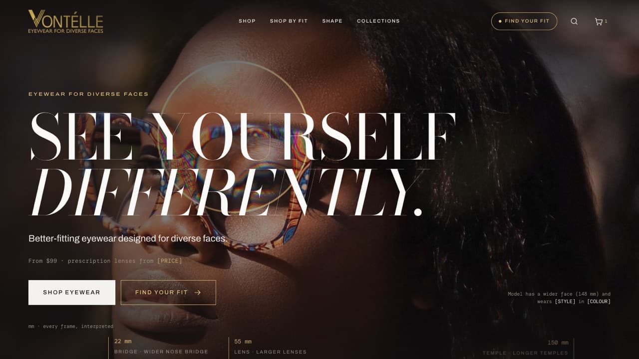
Vontélle
EYEWEAR / INCLUSIVE FIT - 09
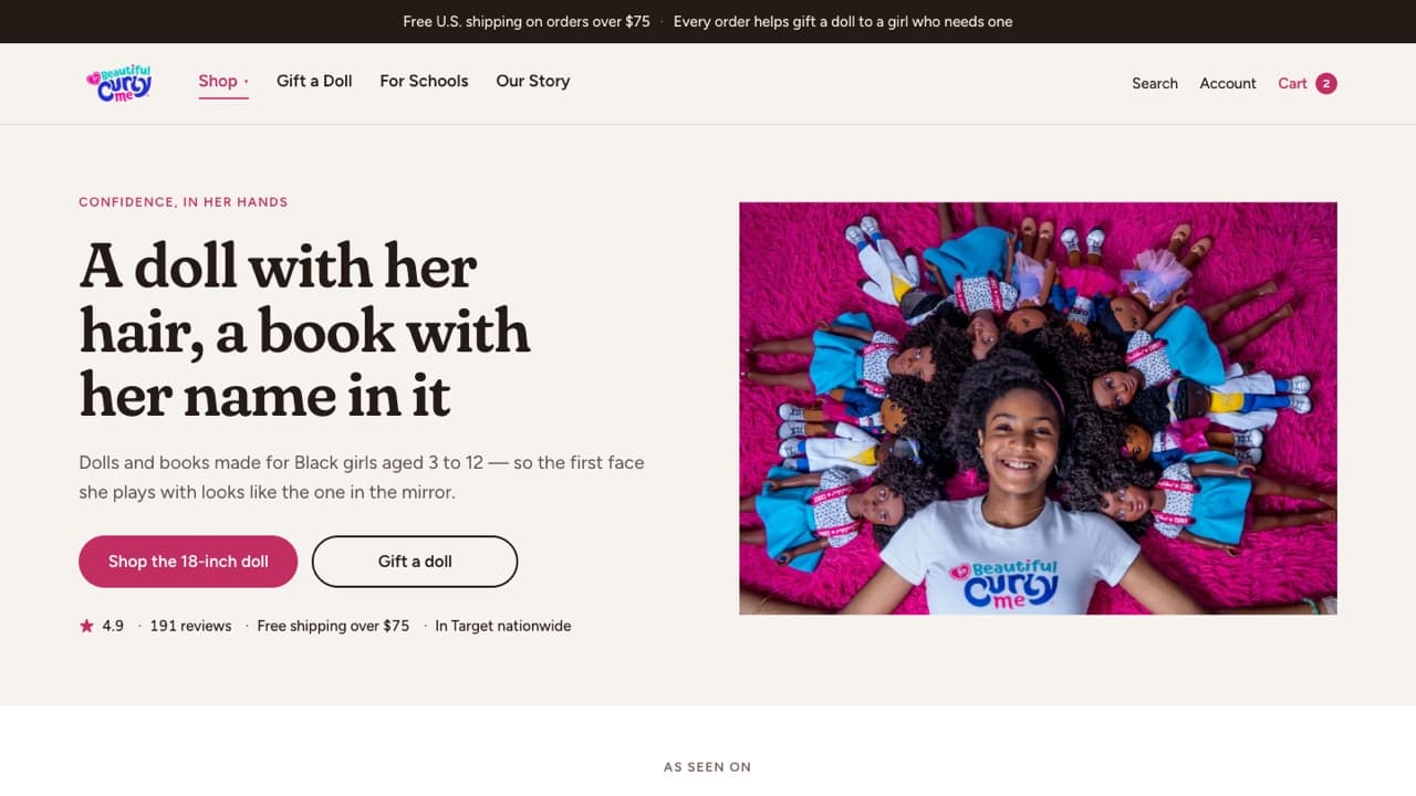
Beautiful Curly Me
DOLLS & BOOKS / CURL CONFIDENCE
The same care,
for your store.
Every concept here grew out of these packages. Pick the one your store needs first.
 Strategy
Design Audit
A fresh pair of eyes. A clear next move.Delivered as a PDF report with annotated screenshots$99 USD Strategy
UX Research
Understand the people behind the purchase.Delivered as a PDF research report$99 USD Design
Theme Redesign
Your brand’s story, in storefront form.Delivered as Figma design files, or a ready-to-import Shopify theme .zip with developmentFrom $599 USD Strategy
Product Architecture
Make finding the right thing feel effortless.Delivered as a PDF plan with the navigation map$299 USD Content
UGC Video Generation
Creator-style videos, without the shoot.Delivered as MP4 video files in 9:16$199 USD Support
Monthly Maintenance
A little care. A shop that keeps getting better.Delivered live in your Shopify store, with a monthly summary$499 USD / month
Your store could be next.
Every concept here began with a real storefront and a closer look. Yours can start with a conversation.